Monthly Archives: January 2012

Now We’re Talking – Weaselhead Rhythms Studio Version

Weaselhead Rhythms


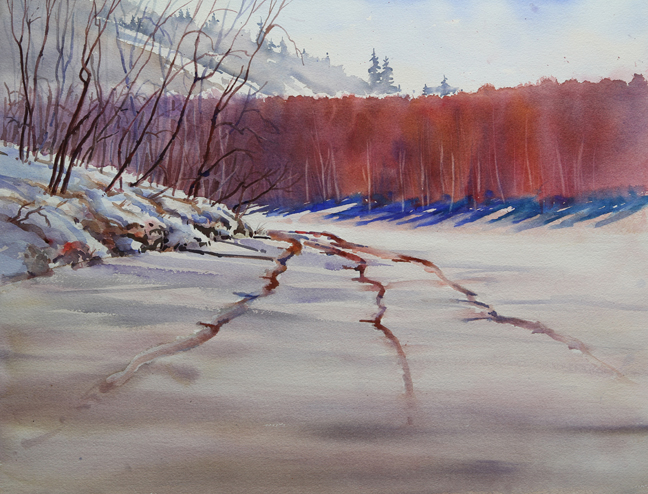
This is a studio version of a plein air painting done in the Weaselhead Wilderness Area minutes away from our house.  I’m very excited by this painting.  For one thing I think it translated extremely well from the smaller original.  It’s related but different and has a life of it’s own.  Most importantly it also represents another step in my artistic journey.  It was a nice painting with a lot of positive elements but nothing more until the last 15% of the painting when I added the rhythmic strokes horizontally across the mid ground.  They were completely fresh and spontaneous strokes made with my favourite brush for this type of effect – a large squirrel wash brush.  Anyway, I think that those strokes took this painting to the next level  and I’m very excited by it.  These spontaneous brush strokes are starting to happen more frequently which I attribute to all the practice and exploration I’ve been doing in the last year.  Now the only thing I’m wondering is after I darkened the mid ground hill on the left I’m wondering if these horizontal strokes could be even a darker value.  I’ll just live with this for a while to decide.

Weaselhead Rhythms
watercolour
18″ X 24″

To purchase this painting or for more information contact me.

Thumbnail #3


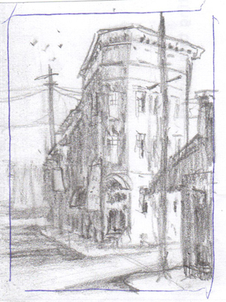
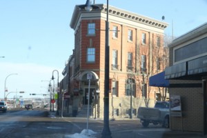
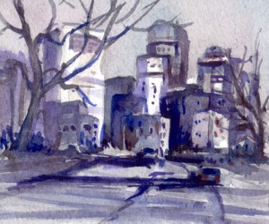
This image is a view of an neat looking building in Lacombe, Alberta.  The most interesting part of creating this composition was to change the format from the horizontal format of the photograph to the vertical format of the thumbnail.  The shape of this building seems to lend itself to a little distortion.  I’ve made it taller and skinnier than the photo which I think nicely fills out this vertical format.


The Benefits Of Experimentation

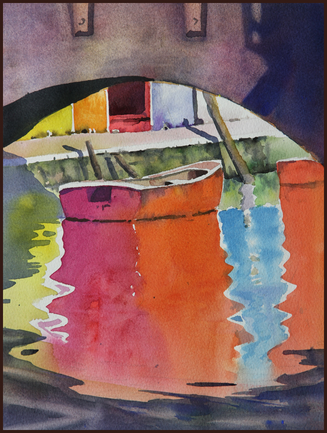
This is the image that I painted in my latest video clip.  It’s another version of the painting I posted a couple of days ago.  I liked lots about that painting but I knew it wasn’t finished.  For all the colour and nice bits it didn’t work as a painting.  My eye was not drawn to the centre of interest.  I received a couple of very interesting comments on that post including one from Richard in Texas who also really liked it but also realized it had some issues.  Anyway I worked on that picture for a few days to try to figure it out.  I did various versions and tried different effects.  It was a lot of work but in the end I think I figured it out.  As well as problems with the shapes, as Richard pointed out,  the main issue was that the centre of interest needed some darks to draw your eye in.  As it was your eye kept getting caught up in the darks of the bridge and it was a struggle to get past that.  What thrills me about this whole experience is that it reinforced to me that my style is one of experimentation.   I’m not able to just intellectualize what will fix a painting problem.  I have to experiment and try different things which is a lot of work but I don’t mind that at all as long as I get to the solution.

I dealt with this issue quite a while ago in the post The Case For Experimenters.  That post got a lot of reaction and I continue to discover in new ways that I am an experimenter.  I have to practice and play continually to discover my voice in watercolour.  It’s all about miles on the brush.

Anyway, this painting, which was created for my watercolour class, was a tremendous learning experience and I’m very grateful for that.

South Glenmore Plein Air

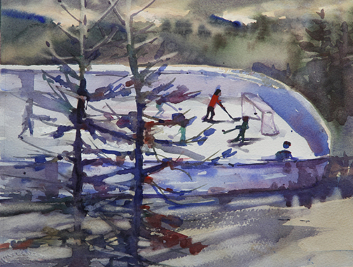
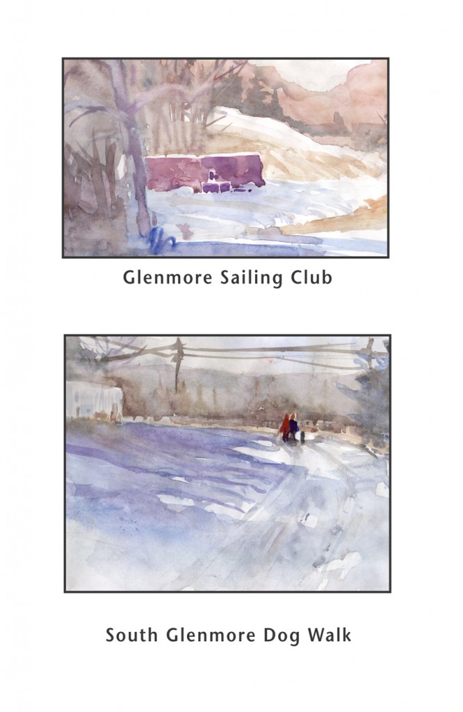
I have to fess up that one of the first things I look for in going plein air painting is convenience or close to home.  I don’t often have the opportunity to get away for a whole day or even half a day so I like to go somewhere where I can do a painting or 2 in about 2 hours max.  I’m also motivated by some advice I’ve heard a lot, ‘find a comfortable place to paint’ and then look around and see what’s there.  If there is some sunlight almost any location can reveal something worthwhile.  For these 2 paintings I went to South Glenmore Park but the scene I was looking for (boats) was all packed up for the winter.  So I just stopped, looked at what was in front of me, squinted to get an idea of the values and then just painted.  Both scenes didn’t seem very promising but I had a lot of fun and learned a little more about comparing values en plein air.

Let There Be Colour

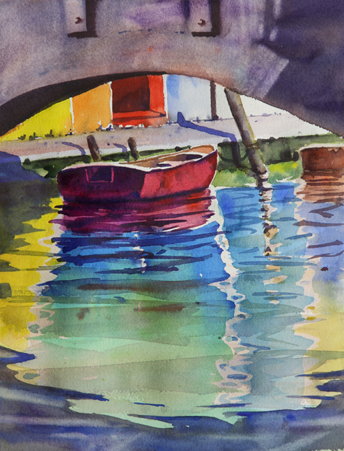
This is another image that I’ve been working on for my watercolour class.  I want it to be all about colour, lots of colour.  I really love doing the reflections of things in the water.    I think that as colourful as it is it may not be in it’s final form.  My question is do the reflections need more work.  They are each one colour from the boat to the bottom and maybe they could be broken up more.  Either broken up with some detail or maybe by adding another colour.  I’ve long wanted in my painting to have bright colours and this certainly has that.  A very contemporary feel.

I used a very neat watercolour technique that I learned from one of my early influences, Zoltan Szabo.  The bridge at the top was all painted exactly the same colour and value as the shadow at the right side.  Then when it was dry I lifted out with a wet brush all the rest of the bridge except for the shadow.  It’s a lovely effect that almost seems to create a drop shadow around the shadow.

Floral Demo For Watercolour Class

This is my copy of an image by a watercolourist that I know nothing about whose last name is Haverty.  I love the soft, delicate nature of it.  I also think it’s a master stroke to leave the table white and to show it by painting negatively around it.

This is a painting for my watercolour class and I think they’ll love it.

I will have a video clip that will be posted shortly on me painting this subject.

Under A Bridge Darkly


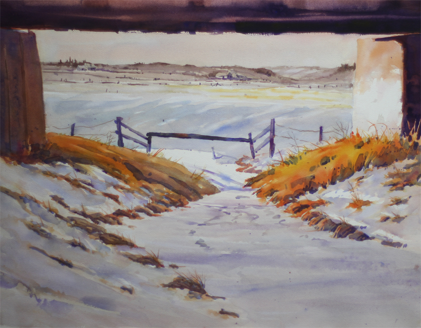
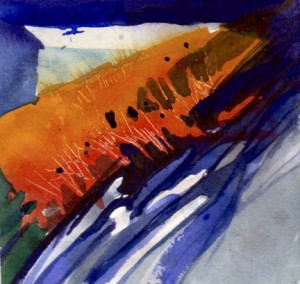
This is a studio version of a scene we found somewhere up near Didsbury.  It had lovely contrast both in value with the dark railway bridge and also strong colour contrast with the bright orange grasses and the general blue and neutral tones of everything else. I had to think quite a while how to have the shadows on the bright grasses.  I toyed with the idea of doing them with a dark warm wash but settled for a wash of blue and I think that works quite well.

Under A Bridge Darkly
watercolour
18 X 24

Demo For Watercolour Class – Landscape With Bridge

This is the demo I did for Tuesday’s watercolour class.  I didn’t get it all done in class so I finished it when I got home.  I like it better than the one I did for this weeks video.  I think that the darkest trees just above the bridge have some interesting shapes to them and their dark value works well with the  dark values under the arches.  I also like the sky.  In terms of what I would change next time is the colour contrast between the distant mountains on the left side and the sky.  They are both very cobalt blue-ish and I think the mountains should have a different colour.  A more neutralized blue would work.

This painting uses a triadic colour scheme: cobalt blue, yellow ochre and cad red light.  I added a fourth colour thalo blue just so we could start to appreciate some of the special qualities of thalo blue.


Painless Colour Studies


I’ve frequently commented on how useful I find thumbnail sketches.  They are very helpful with my composition and value, 2 areas that I have had difficulties with.  I finding that I’m also starting to do and benefit more from these little colour studies.  When I’m doing my ‘serious’ painting I work at my easel or painting table but I often study my photos at the computer using Photoshop.  These little colour studies are done at the computer with my plein air palette.  They are just free little exercises where I practice things that I notice in the photos and try different ways to represent them.  So it’s the purest form of exploration and again it’s a very small investment of time yet I learn lots from doing them.

These are 4 recent examples.  Two of them are off shoots of the painting from a previous post “Under A Bridge Darkly”.  The Calgary Skyline image is an idea that I’m considering for my demo for the Calgary Sketch Club on Feb 2, 2012.  I always liked the sketch but as was my habit at the time I never recorded any value pattern so I’m trying out different value patterns now.

These paintings average about 4″ on the longest side.