Tag Archives: cityscape

Gibsons Landing Workshop

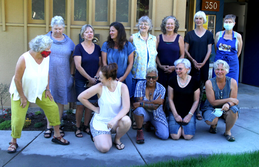
I had the pleasure of offering my first in-person workshop in 16 months.  It was for the Gibsons School of the Arts.  They do a fabulous job of presenting quality art workshops every summer.  They are a very vibrant and friendly group.

The participants in the workshop were also an especially great group to work with.  
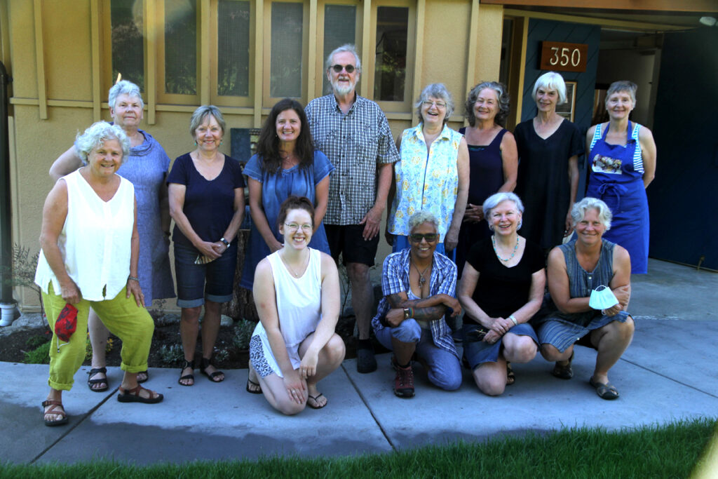
Rex Beaanland, Class photo, Gibsons
A great group of enthusiastic watercolourists

The Paintings
 Piazza del Popolo

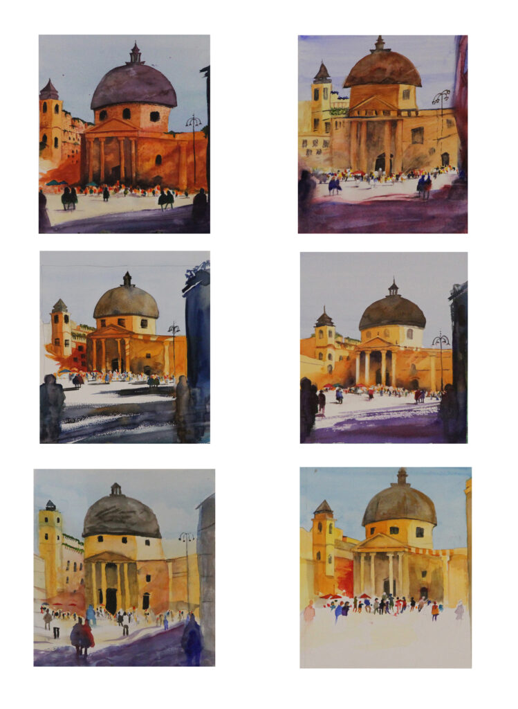
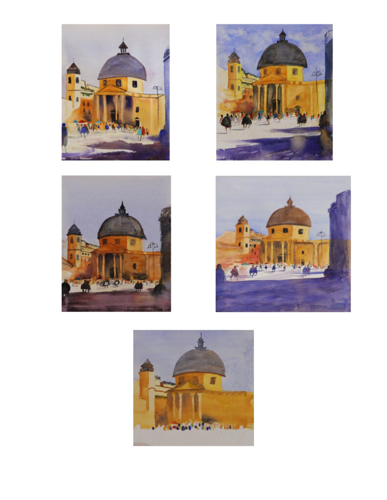
The first demo was of the Piazza del Popolo. It’s a great subject that teaches so many useful watercolour skills. We took a lot of time learning how to create a mass of background figures.

I’m including a detail of these figures. They tend to look unfinished when you look at them up close but from a distance they magically become figures.
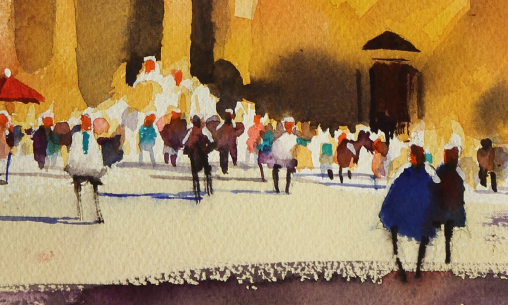
Another thing that I use frequently in urban landscape painting is what I call ‘ghost figures’. They are figures in the foreground that are there to draw you in to the painting. I particularly like the way that their lower half sort of disappears.

Ghost Figure

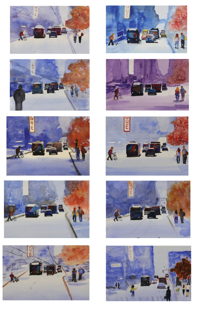
The participants’ examples.

Granville St

The last demo we did  was a scene from Granville St in Vancouver.  We didn’t have time to finish it but you can see that everyone is well on their way.
Boats At Gibsons

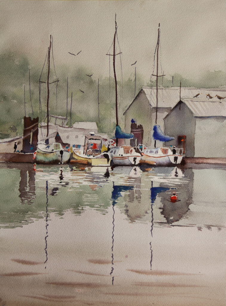
We also did a painting of boats at Gibsons.  This was a challenging painting but as you can see from our Wall Of Fame  it was also well done.

Rex Beaanland, wall of fame, Gibsons
The Wall Of Fame

The workshops are now being held in the High Beam Dreams which I believe was originally a church.  A great space.
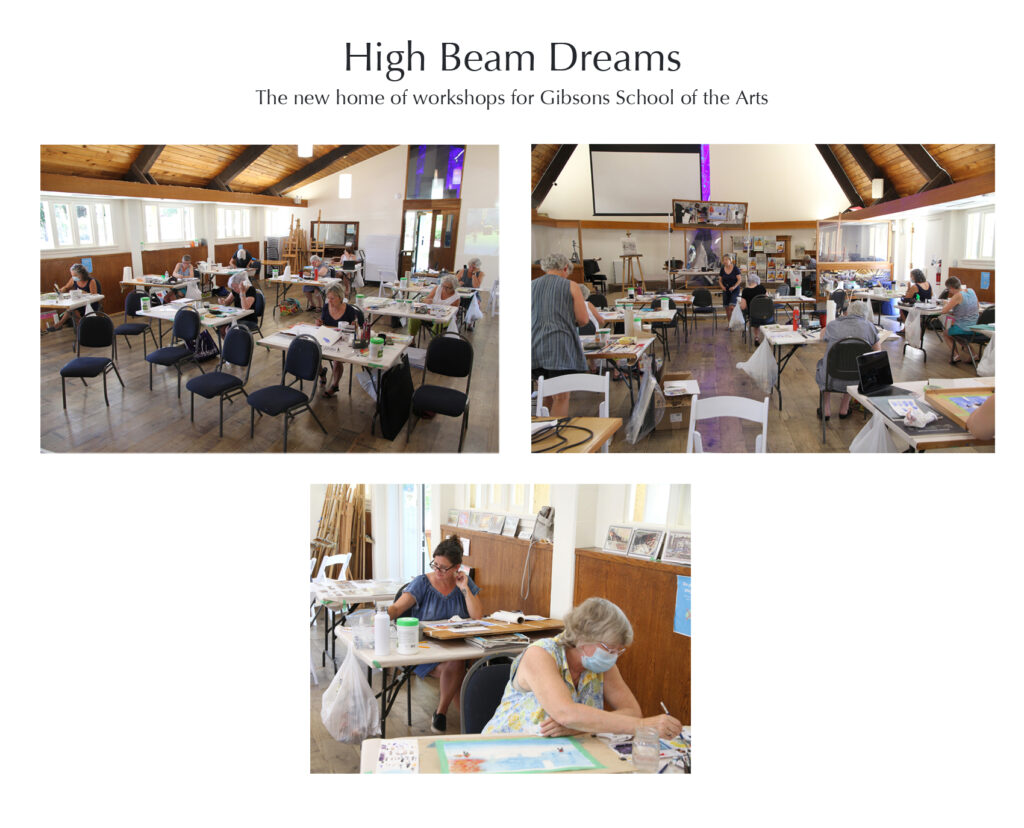
Rex Beanland, high beam dreams, Gibsons

My demos

Here are the paintings I did.  I finished them off at home.

Rex Beanland, Piazza del Popolo Gibsons
Piazza del Popolo
Rex Beanland, Boats at Gibsons, watercolour, 20 x 15
All Quiet In Gibsons
Rex Beanland, Granville St, watercolour, 15 x 20, Gibsons
Granville St

Thanks

I just love teaching art so it was a wonderful experience being in Gibsons.  Many thanks to everyone who participated for making it such a great experience.  Thanks also to Dee for being my excellent assistant!

Rex Beanland, Dee paints, Gibsons

Plein Air Painting

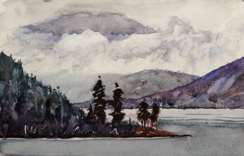
After the workshop Susan and I spent a week meandering to the end of the Coastal Highway (about 150 km).  I did a few plein air paintings which I super enjoyed.  I remember so much more of a location when I paint it then I ever do from a photograph.  It’s the greatest way to visit new locations.
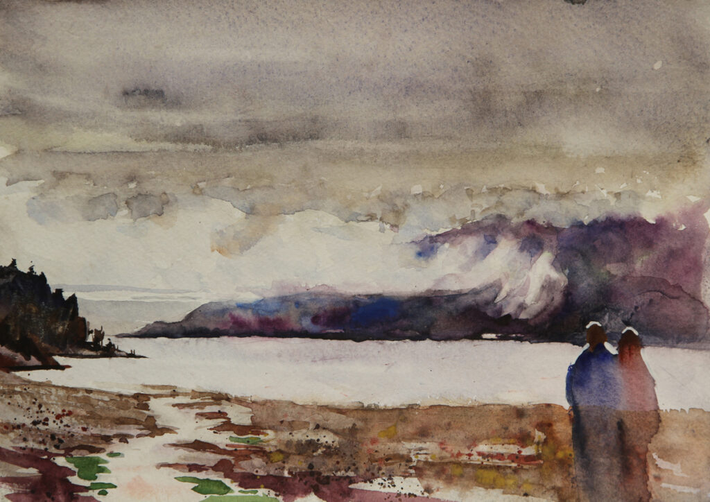
Rex Beanland, Lang Bay, watercolour, 9 x 12
Lang Bay
Rex Beanland, Saltry Bay, watercolour 9 x 12
Saltery Bay
Rex Beanland, Historic Town Site, Powell River, watercolour, 15 x 11
Historic Town Site – Powell River
Rex Beanland, Pender Harbour, watercolour, 11 x 15
Pender Harbour

It was truly a great experience!

Rex Beanland, class photo 2, Gibsons

Leighton Centre Workshop

Rex Beanland, Calgary Centre Cut (Demo), watercolour, 18 x 18

Calgary Centre Cut (Demo)
watercolour
18 x 18


Rex Beanland, Seaton Seafront (Demo),  watercolour, 18 x 24

Seaton Seafront (Demo)
watercolour
18 x 24


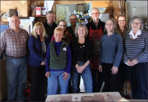
Rex Beanland, Leighton Centre Workshop Students

A Great Group


It was an excellent workshop last weekend at the Leighton Centre.  A great bunch of people and very enthusiastic.  It was also very neat to drive out to the Leighton Centre in the early morning light.

One of my goals for this workshop was to make the best use of the magical first wash in watercolour.  It was very gratifying to see everyone tackle that important aspect of watercolour painting.  Another very useful that idea that floated around the class was stated as “it’s only a piece of paper”.  If we look at our paintings  like that then we are more likely to just have fun and see what happens.  What if . . .

I added finishing touches to both paintings when I got home and it might be helpful to take a look at them.

The Critique

What I Like

Calgary Centre Cut is a painting idea that I am developing and I find the composition very exciting.  I love the lead-in of the road.  The story I want this painting to tell is of everything and everyone being drawn into Calgary as symbolized by the Calgary Tower and I think it has a strong sense of this story.  I like the centre of interest around the Lion Statue on the right.

I also enjoy the composition of Seaton Seafront.  I find the 2 poles which were attempts to deal with some of the dripping an interesting element.  I love the blue – purple colour contrast in the background hills and this is played against the warm orange in the middle of those hills.  The wall is a very effective lead in to the painting.  The little use I made of gouache is also effective particularly in the small light reflections in the puddles on the pathway.

What I Would Like To Change

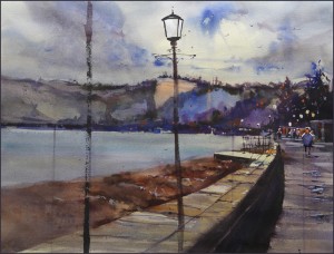
Both paintings by this point have been a little over worked.  That beautiful first wash has been diluted by subsequent washes.  In Calgary Centre Cut as much as I like the dark shapes I added to both edges I don’t like the colour choices.  The purples don’t work well with the overall colour scheme. In Seaton it’s mostly that the second wash in the sky takes away that lovely sense of light it had at first.  I would also like to make the wall wider at the bottom and  make the colour notes in it more to the blue side so it contrasts with warm beach.  The original study that I did before the workshop shows very effectively the sense of light that can be had when that first wash works.

Anyway, thanks to all who attended and keep painting.


Demo For The Airdrie Regional Arts Society


Rex Beanland, Kensington Market, Toronto, watercolour, 20 x 15

Kensington Market, Toronto
watercolour
20 x 15


This is the demo I did last week for the Airdrie Regional Arts Society.  I hadn’t known about this society before but was very impressed by their enthusiasm and friendliness and the commitment of the members.

For the demo I choose a scene from our trip to Toronto last month.  It’s in the multi-cultural area of Kensington Market.  There is a nice energy there. I mostly finished the painting during the hour and a half of the demo then touched it up in the studio.  I’m pleased with the way it turned out.  Doing this demo helped me refine my thoughts about what I’m trying to achieve in my painting and for me it’s all about ‘story’.  Accuracy, neatness and polish are not as important as the story.  The story I wanted to capture in this painting is the energy and movement in this area of narrow streets and crowded sidewalks.  In summer it can be chaotic but even in  December parts of it are still alive. Using the little figures  immediately helps with the story.  For example the two figures near the right hand edge really do seem to be in conversation.

More Sketches Of Toronto – Yonge St

Rex Beanland, Yonge St North, watercolour, 9x12

Yonge St North

Rex Beanland, Yonge St North2, watercolour, 18x9

Yonge St North2


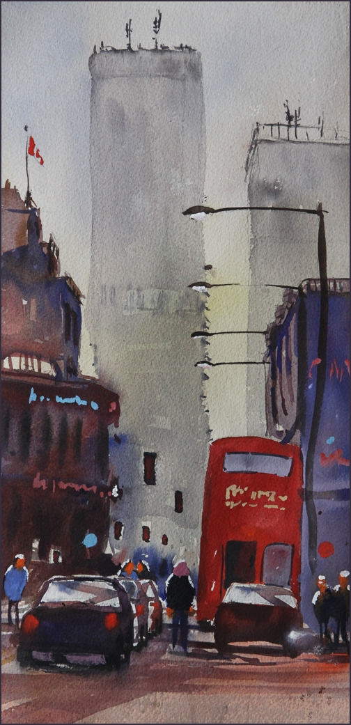
This is another scene from our trip to Toronto.  It’s a view driving north on Yonge St.  It was interesting to have a double decker bus driving tourists around the city.  I haven’t been to Toronto for about 3 years but I was raised there and I have to say that I really like that city, warts and all.

But on to the painting.  I find that I’m using my chinese white or white gouache a lot lately.  Partly that’s because I’m using it to correct things. That is not the best use of the opaque medium – to cover mistakes but if a painting has things wrong with it what else can you do.  But at other times, however, using opaque paint is part of the plan.   I use it frequently because it allows me the freedom to forget about the detail and just make a big juicy wash.   Then after I can add the lights with the chinese white or the white gouache.  If I didn’t do this I’d have to either paint around various shapes which destroys any creative brushwork or to use masking liquid which just isn’t on my radar at the moment.

In the top painting I used this technique to lighten the entire distant building.  I used chinese white and cad red light to make the nice bright pink writing.

In the bottom painting I used a lighter opaque blue where the blue building meets the edge of the bus.  The original wash was too dark so that there was less contrast with the dark red bus.  With this lighter wash the contrast is increased.

In the top painting the bus stands out nicely because it’s up against  lighter washes.