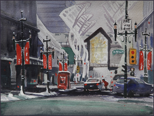
I think this image has a lot of potential. The original scene is very complicated with lots of elements including buildings, cars, a person, signs galore and whatever those large white shapes are. My goal was to try to simplify and connect shapes. I also wanted the painting to speak of Christmas.
Traditionally I would try to paint each window, building, car as separate shapes. I would try to match the colours that were actually there. Now, I want to do it differently by concentrating on value and connecting and simplifying the shapes. This image is a step in that direction though there is still a lot of room for development. When done well there is a unity and focus to the painting.
As mentioned in a previous post, an experimenter like me must keep trying different versions in order to work out what simplification actually looks like. It’s so easy to recognize when we see it in a finished painting but to see it plein air is a different beast.
Because of the comments received from Shelley I’ve put up the original version of this painting. The larger one is the same image with various darks strengthened.
This image is 8 X 11. I’ll have another chance to do it in a larger version. I’ll post the results.


Hey Rex,
I was all ready to comment on this painting and see a different version here. I thought that other version was really strong and liked reading your post on simplifying shapes. It was one of my favorite of your architectural paintings… Hope to see it and/or a new version soon :o)
Hi Shelley: Yes, I’m doing a few different studies in part to get ready for a workshop I’m giving this weekend in Okotoks. Also I’m really trying to figure out my process. In other words I’m in the practice/experimentation stage. Rex
I really like both versions by the way. One thing that was neat in the previous one you showed was the lumuninescence of the yellow window. It was neat to see the primary triad of that, the red banners and the blue car. I like how the glass was “glassy”, the banners “clothy” and the car “metallic”. I also liked how the the snow meandered into the shape of the large wind sculptures. That ultra-modern shape was intersting juxtaposed with the more traditional light standards that have an almost orientalist feel with the red banners in therm. I also liked the interesting mysterious narrative of the figure and the “one way” sign. As always, you have a real way with architectural city-scapes, Rex. Makes me look at Calgary with new eyes.
Shelley, I could listen to your comments all day. This version is the first version but with the darks strengthened here and there. There is something I find very interesting about this scene though I hadn’t analyzed it as well as you did. I put the original version up again so you can see the difference. Rex