The Beauty Of The Foothills (and the ability to make changes in watercolour)
Living in Calgary the mountains are an iconic part of the landscape. They are certainly majestic but I find that I am drawn much more to the beauty of … Read More
More On The Three Wash Method – Union Cemetery
I’ve been reading a lot, lately, about the benefits of trying to complete a … Read More
The Three Wash Method Of Watercolour
During the past couple of weeks I have heard 2 well known watercolourists talking about their process, particularly their plein air (on location) process. Both of them said that their … Read More
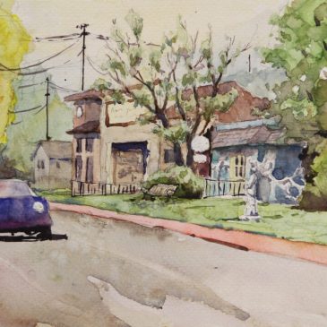
Leighton Centre Workshop
It was an excellent workshop last weekend at the Leighton Centre. A … Read More
Seaton Beach – The Magic Of That First Wash
I’m very excited by this painting. It’s from our trip to England about 3 years ago. It’s the sea front in a little town called Seaton on the south coast. … Read More
More Acrylic Works
I’ve … Read More
The Power Of Play
I am a firm believer in the power of play in our art journey. Those times when we are completely unconcerned with the product and just playing with the process can yield some … Read More
Car Arches Detail
I posted a painting a few days ago. It’s a copy of a Joseph Zbukvic painting. This particular image is a cropped section of the original painting showing just the centre of … Read More
Forest Fantasy 2
This is definitely a one off. Again it was an old pencil value sketch that I did a few years ago. I was just in the mood to try something different so I thought … Read More