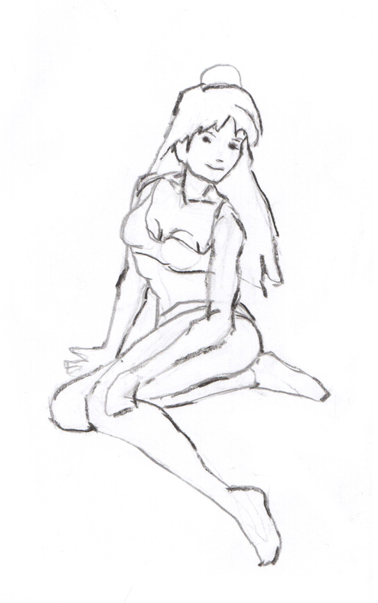
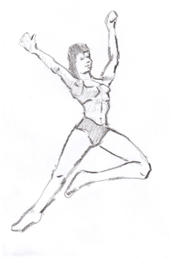
 The first goal in the Dynamic Figure Drawing class is to get a proportionally accurate, balanced figure. The next step is to bring your drawing to life with shading and expression. This image is about bringing the figure to life. The challenge is to find a way to simplify the shading and detail to make it work on a head that is about 1 inch high. The techniques that work so well with a life size portrait don’t necessarily work with these little faces. Again the people who have done the most to create a style of shading for these small figures are the artists who draw comics and super hero type characters.
Monthly Archives: October 2011
Plein Air
Dynamic Figure Drawing
 This is a real fun image based on a superhero from a graphic novel. Since I’ve been working on this Dynamic Figure class I’ve become very impressed with the quality of work of many of the people who draw super heros. These are serious anatomy drawers. I also like the starkness of the values in many of these drawings. They use simplified, very, very dark shapes to indicate the intricacies of the anatomy.
Dynamic Figures
In drawing dynamic figures the first challenge is to get the proportion of the parts of the body correct. After that the next challenge is to make sure that your figures are balanced. The next stages are to begin to add a dynamic energy to the figure. After that comes the ability to give your figure a personality. I’m still dealing mostly with the balance and energy but I’m beginning to see, on occasion, something that actually looks like a real person.
In both these images I’m trying to use ‘line weight’ or the variety in the darkness of the pencil line to suggest lighting.
A Lesson On Using Photographs
 This is the lesson from last night’s watercolour class. The goal of the lesson was to encourage the students to look at photographs (or for that matter a plein air scene they might find themselves in front of). Rather than just copying it we’re trying to see it as just a collection of shapes that we as the artist can, and in fact, must rearrange, redesign and play with to create our own composition.
The original photo is shown. I took the photo and created 3 quick thumbnail sketches each with a very different focus. One concentrates on the barn as the main subject, one focuses on the mountains and the third is about the foreground. These sketches take about 3 minutes and are done in exactly the same format as the large painting that I have planned. In this case they are done in a 9″ X 12″ format but on a smaller scale. For each of these 3 thumbnails I did a quick value study using black watercolour. If the painting works at these early stages you can be fairly confident that it will work in the larger format.
The beauty of this approach is that it offers so much information for a total out lay of time of about 15 minutes per image. I have talked to a lot to artists of all ability levels about the use of thumbnails and some swear by them while others don’t find much value in them. I guess it’s a case of each to their own but I know that for me they are a very important part of the painting process. I also notice that when I use them the resulting paintings are at a much more consistent level than when I just start painting. If anyone has any thoughts on the use of thumbnails I would love to hear it.
A New Way To Look At Value
 Somehow in my mind I have almost exclusively associated darker values with neutralized colours, ie dark grays. So my paintings often were too heavy with this use of dark variations of greys. I have been watching a lot of American watercolourist, Don Andrews’ videos lately and it finally started to sink in that whereas those blasts of dark grays, violets are very useful there is also an entire range of purer pigment darks. The little chart above illustrates this. The top swatches are dioxazine purple, ultra blue, quin rose, cad red light, cad orange and cad yellow light. The bottom swatches are the same colours but converted to black and white. You can see how dark the quin rose, ultra and dioxazine are, even when they are pure colours. So I’m trying to concentrate on using these pure pigment darks. I think it will lead to a much more colourful painting.
The image above is the demo I did in class last night. In it I tried to put these principles to work. I’m thrilled with it not because it’s the greatest painting but because it’s a new approach for me and I can see how this can be an exciting new direction. With bolder strokes of purer colour it’s easier to make my brush strokes more distinctive. I think this is starting to happen in the darker shape at the bottom of the mountains. I like the rhythm that’s starting to develop there.


